Garmin’s Default Zones

Personalized Zones
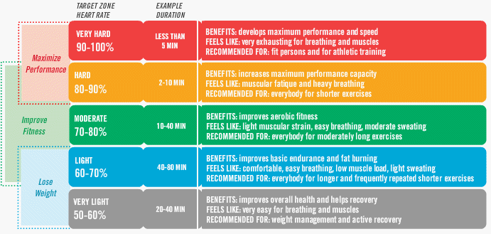
I recently had a performance test (VO2 Max and maximal heart rate). The physiologists assigned personalized heart rate zones using the results of this test. I decided to compare my new zones with my “old” zones. My old zones were assigned by Garmin Connect. Garmin uses a lot of information to create your zones, but can only estimate VO2 Max based on other data. The charts above represent 2 bikes rides. Both rides were with the same riding group, in similar areas north of Seattle. Both rides were very similar in distance, elevation, time and effort. Really only things different are the times spent in each heart rate zone. Even the average heart rates are practically identical! Garmin has me spending a little time in zone 2 and 5 and nearly the whole ride in zones 3 and 4. My personalized zones have me spending most of my time in zone 2. I also spent 30 minutes in zone 1 and no time in zones 4 and 5.
What does this mean and why do I care? Zone training is a bit of a dying art in cycling these days, falling behind power training. I am a recreational rider, I don’t compete, I have nothing to gain from training beyond good cardiovascular fitness, so I see no reason for me to shell out hundreds of dollars for a power meter. Even so, I am motivated to perform at my best, so gazing at my heart rate from time to time makes sense to me. The first thing I was told when I got my zones was that the most useful thing for me to do was to avoid zone 3 (the green zone) better known as “no man’s land”. While this aerobic level is a great place to build strong endurance, apparently you build it faster by spending more time in zone 2, then pushing up to zones 4 and 5. My head sunk when I heard this “green zone” training is the most common mistake made by casual cyclists, as I knew I spent the overwhelming majority of my time in the green zone. It also seemed curious to me how much time I spent in the upper zones. I’d spend some rides almost entirely in the top 2 zones. That didn’t seem healthy. However, by adjusting zones for my real calculated VO2 max, you see that I actually spend most of my time in zone 2, like I should. However, I spent a bit of time in zone 1, which is no zone at all. Zone 1 in this case is sitting heart rate. My lab used a 4-zone method and Garmin uses 5, so my personalized zone 1 is nothing and zone 2 has a wide range encompassing both warm-up and low intensity activity. Since my tracker times out when I am stopped, I spent too much time riding my bike not working out at all. I also spent a bit of time in zone 3, but I think that’s OK for this type of ride. It was a group ride, and our goal was to ride at the same pace, so nothing really called for the higher zone use.
I think it’s pretty interesting how different the graphs look. The “accurate” graph far better reflects my perceived exertion, for what it’s worth.
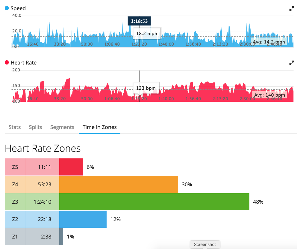
Heart Rate Zone Training Chart
I found this chart from a web search. I don’t like the “lose weight” category. From what I understand, the assumption of using zones to lose weight has been disproven. Even though it is easier and more sustainable for most people to do activity at low intensities (like walking), burning 100 calories walking or doing box jumps is the same 100 calories to your body’s caloric needs at the end of the day. That being said, I liked this chart the best out of the many out there.